Zespri
Rebuilding brand equity and shelf consistency for a global fruit icon.
Agency: Design Bridge & Partners
Role: Design Director
Scope: Packaging System
-
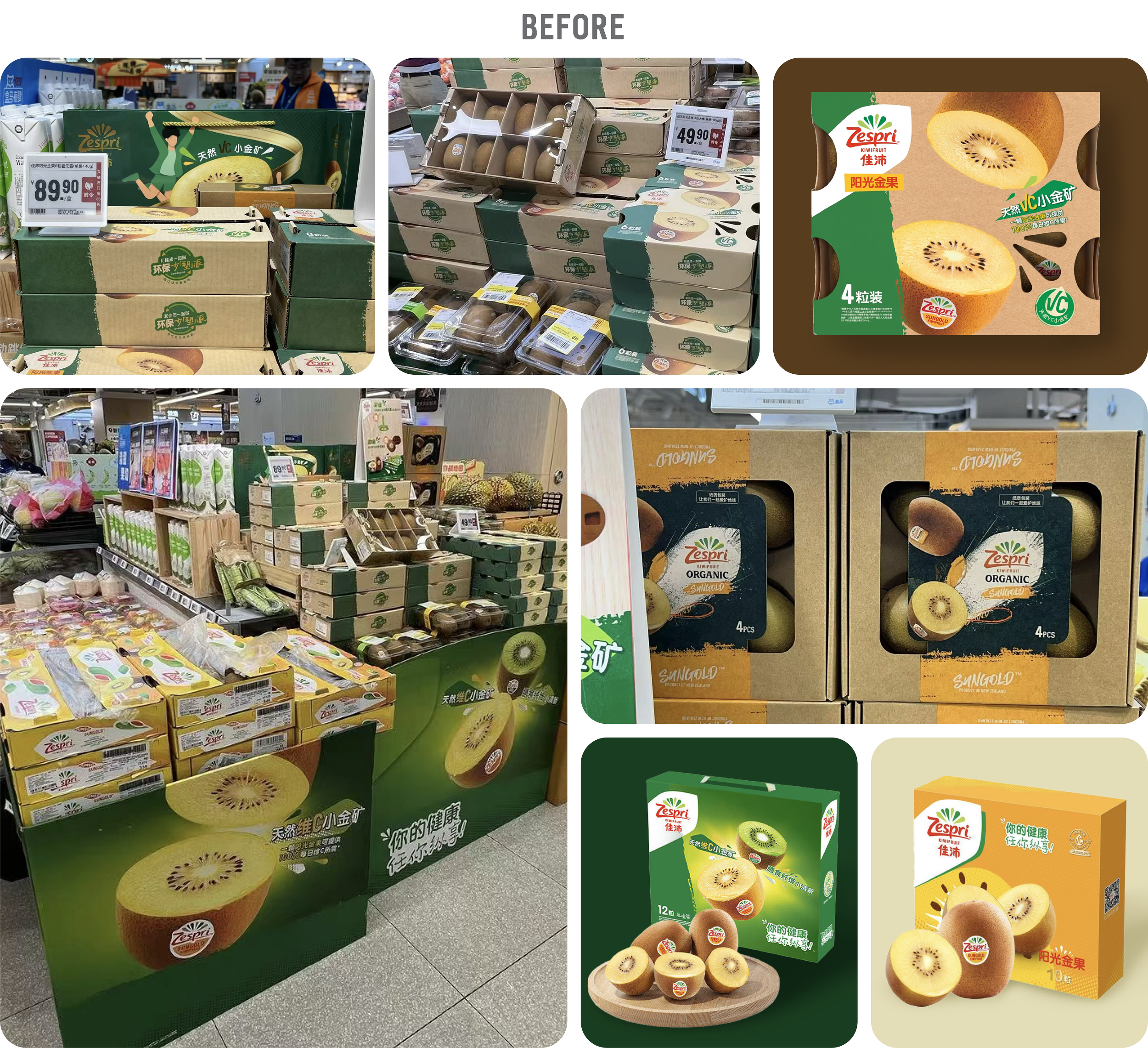
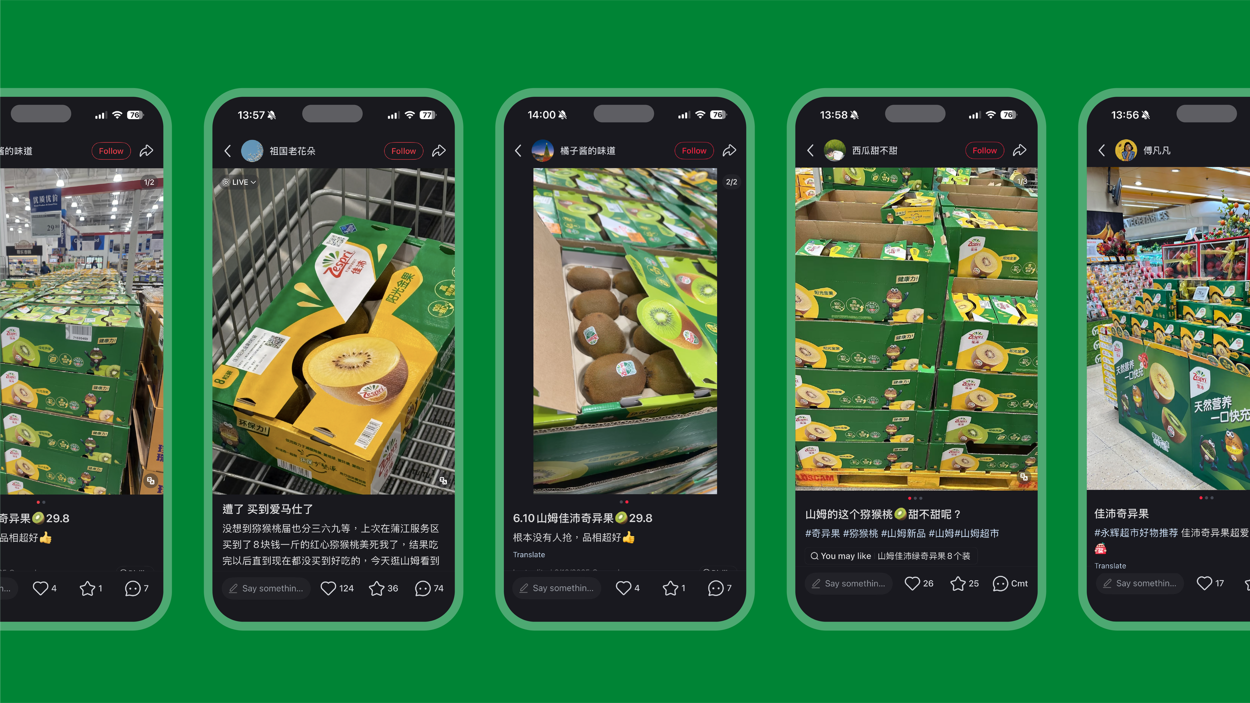
The kiwifruit category in mainland China was saturated, with competitors aggressively competing on price and functional product claims. Compounding this, a lack of centralized execution meant regional distributors were designing their own packaging variations despite existing guidelines. This fragmentation created severe on-shelf inconsistency, eroding brand recognition—with consumer focus groups revealing stronger mental recall for the color yellow rather than the brand's signature green. The challenge was to move beyond this chaotic landscape, resolve distributor inconsistency, and create a unified packaging system that prioritized brand equity over functional clutter.
-
I led a system-wide packaging renovation centered on the strategic pillar: "Vitality In Every Burst."
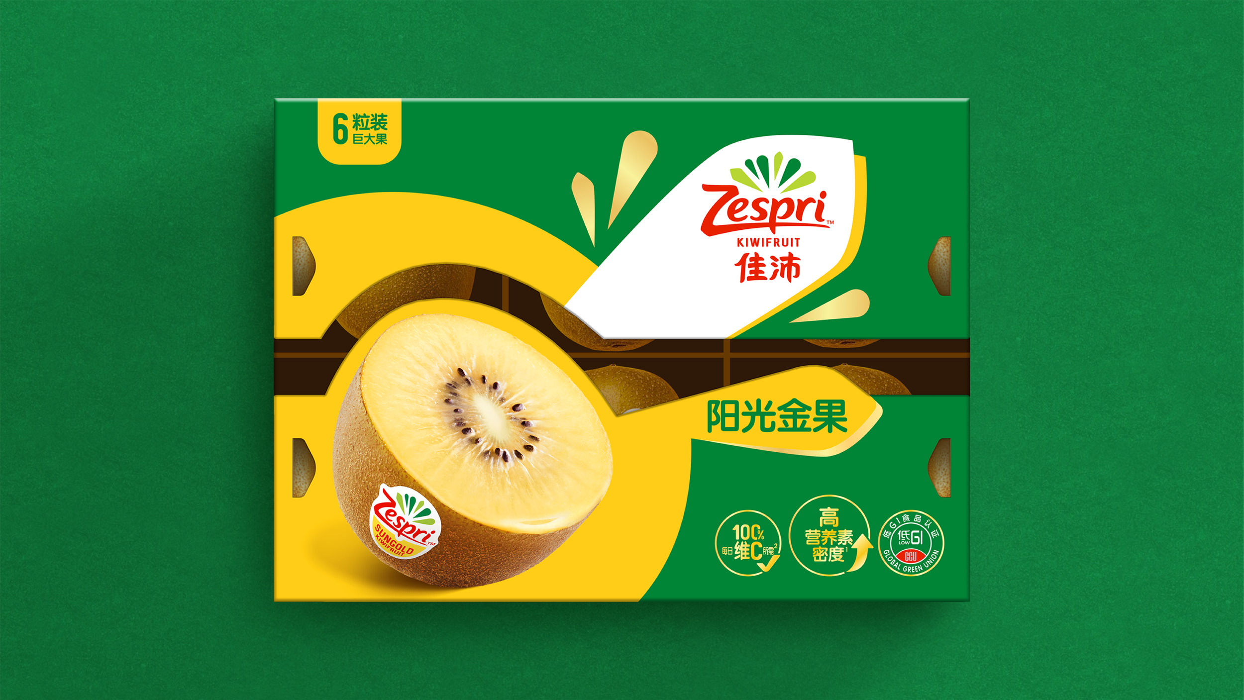
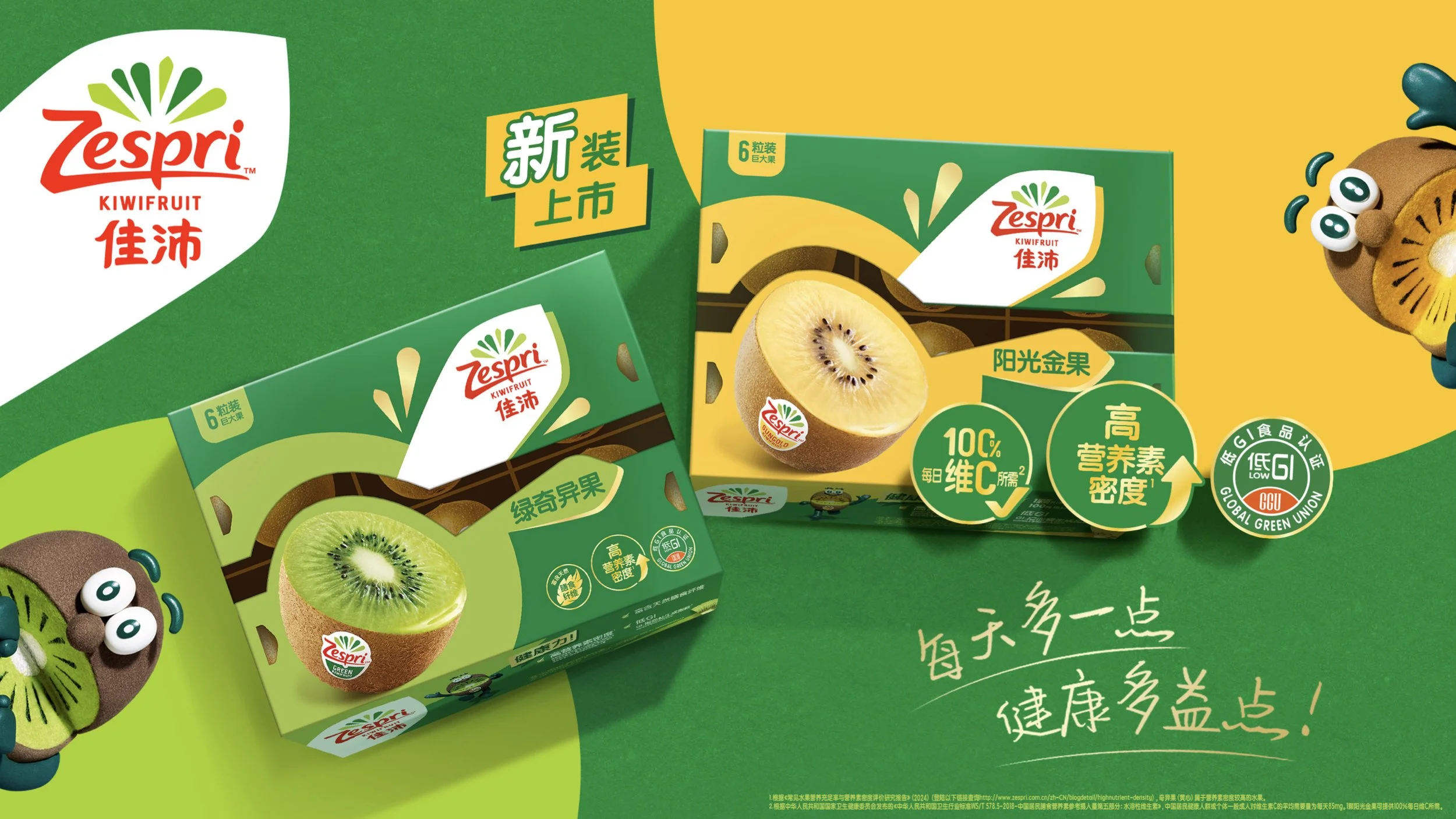
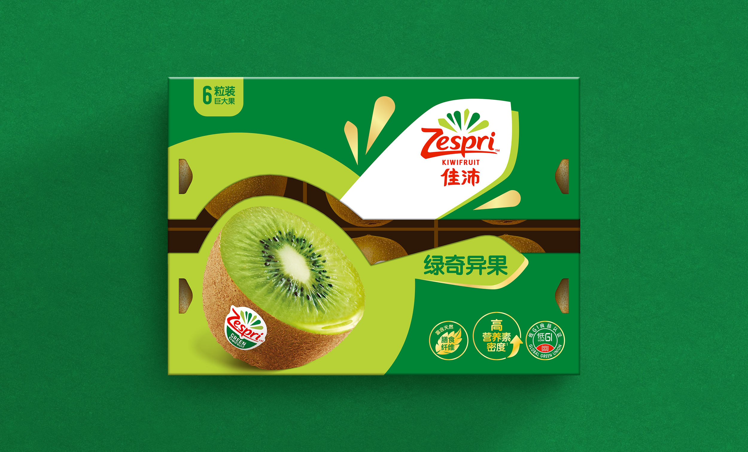
Brand-First Prioritization: I pivoted the design strategy away from badge-heavy layouts. Instead, I scaled the brand's core "burst" asset to anchor the visual field, allowing the packaging to hold back and let the brand voice lead.
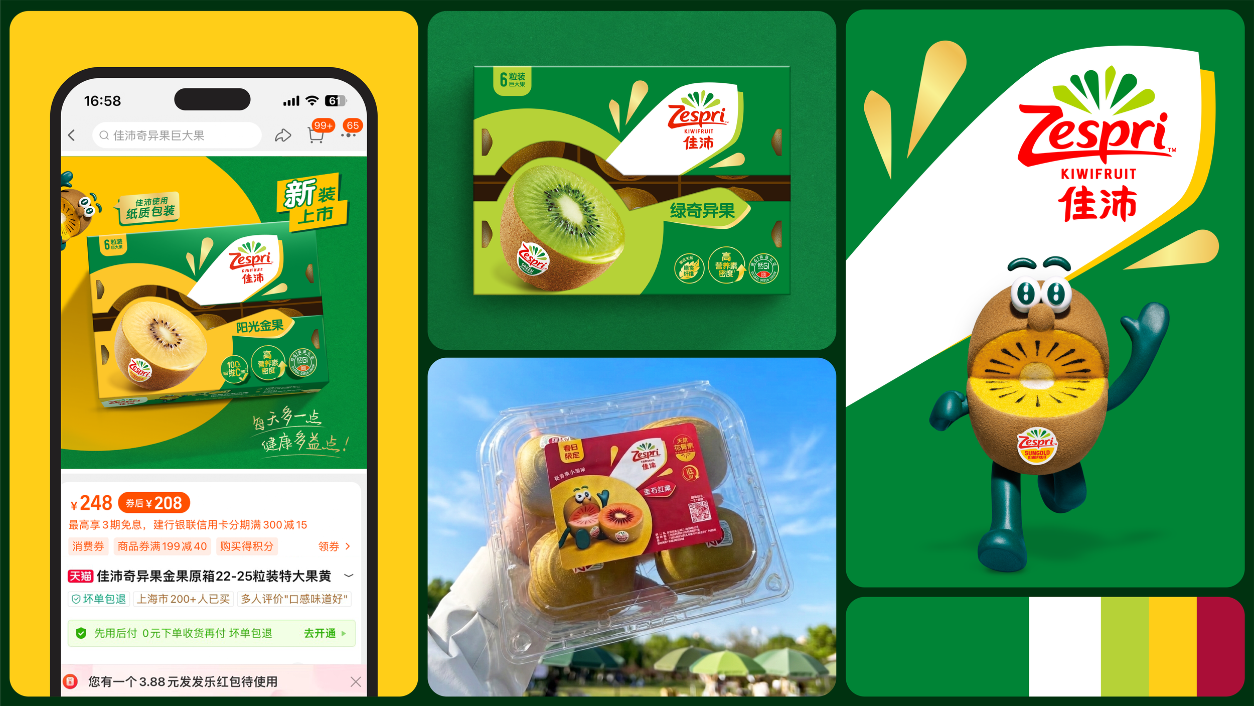
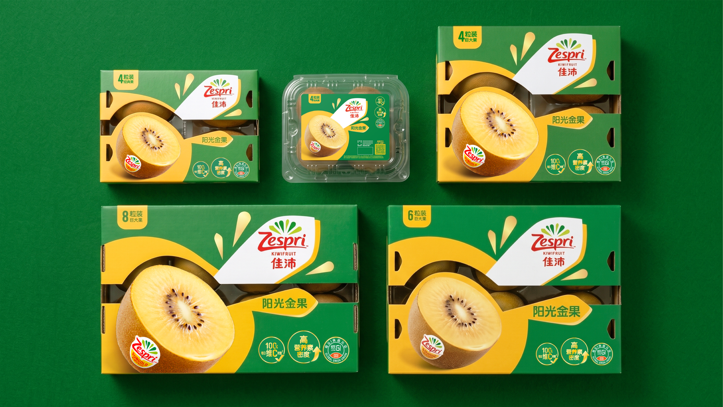
Hero-Variant Communication: I established a clear, confident visual hierarchy using hero product shots for each variant, ensuring immediate product recognition without the need for excessive functional labeling.
Design Validation: I managed a data-driven validation process, using consumer focus groups to test distinct creative routes and address brand recall gaps, ensuring the final direction balanced brand-led design with proven consumer preference before full-scale roll-out.
Distributor Alignment Workshops: I led collaborative alignment workshops with regional distributors to resolve on-shelf fragmentation and bridge the gap between central guidelines and local execution.
-
Competitive Differentiation: Successfully broke through the category "noise" by replacing cluttered, claim-heavy packaging with a clean, high-equity visual system.
Reclaimed Shelf Authority: Established a premium visual language that signals product quality at a glance, allowing Zespri to compete based on brand recognition rather than price while correcting historical brand recall gaps.
Scalable Architecture: Delivered a robust, validated system implemented across a full range of pack sizes and materials, maintaining visual consistency regardless of format or regional distributor variance.